Creative Best Practice
Creative Best Practice
Our Giant Posters come in all shapes and sizes, with every site offering something a little different. We want to help brands optimise the creative space on our banners with guidance on colour use, layout and logo placement. Our in-house Graphic Design team are also on hand to offer mockups and tailored advice, ensuring your campaign makes the strongest impact and captures attention in all the right ways.
Elements
The strongest approach to a creative is to use two or three elements. For example, text, image, logo.
Research shows that creatives with two message elements are 21% more likely to be noticed than creatives with five message elements.*
*OAAA Creative Best Practices
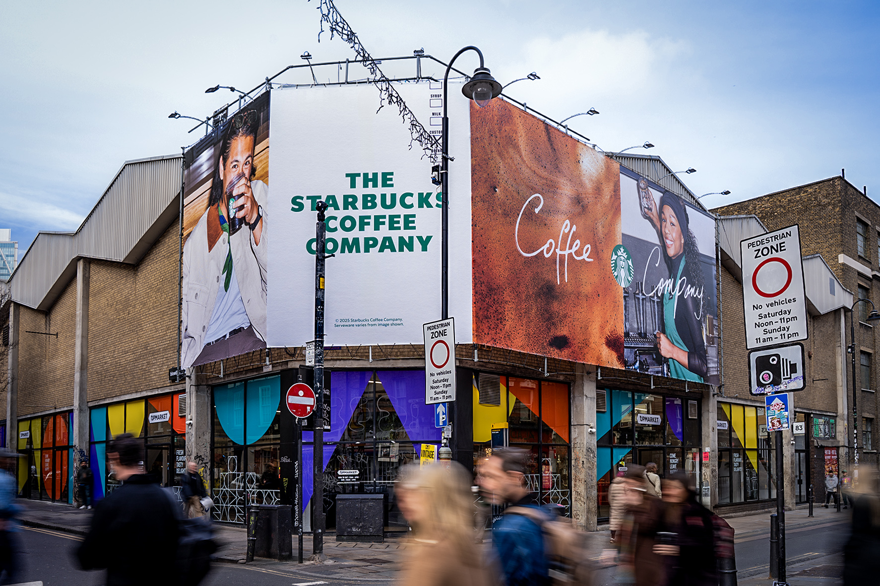
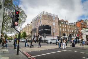
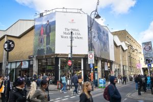
Brick Lane – Smug
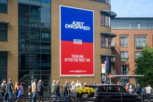
10 Great Eastern Street – Example
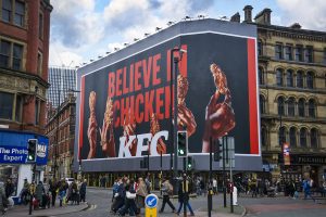
Manchester Piccadilly – KFC
Colour
High Colour contrast has been proven to improve ad recall by up to 38%. Standalone large format OOH ad spaces are best outfitted with bold imagery and high contrast colours.*
*Journal of Advertising Research
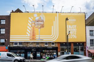
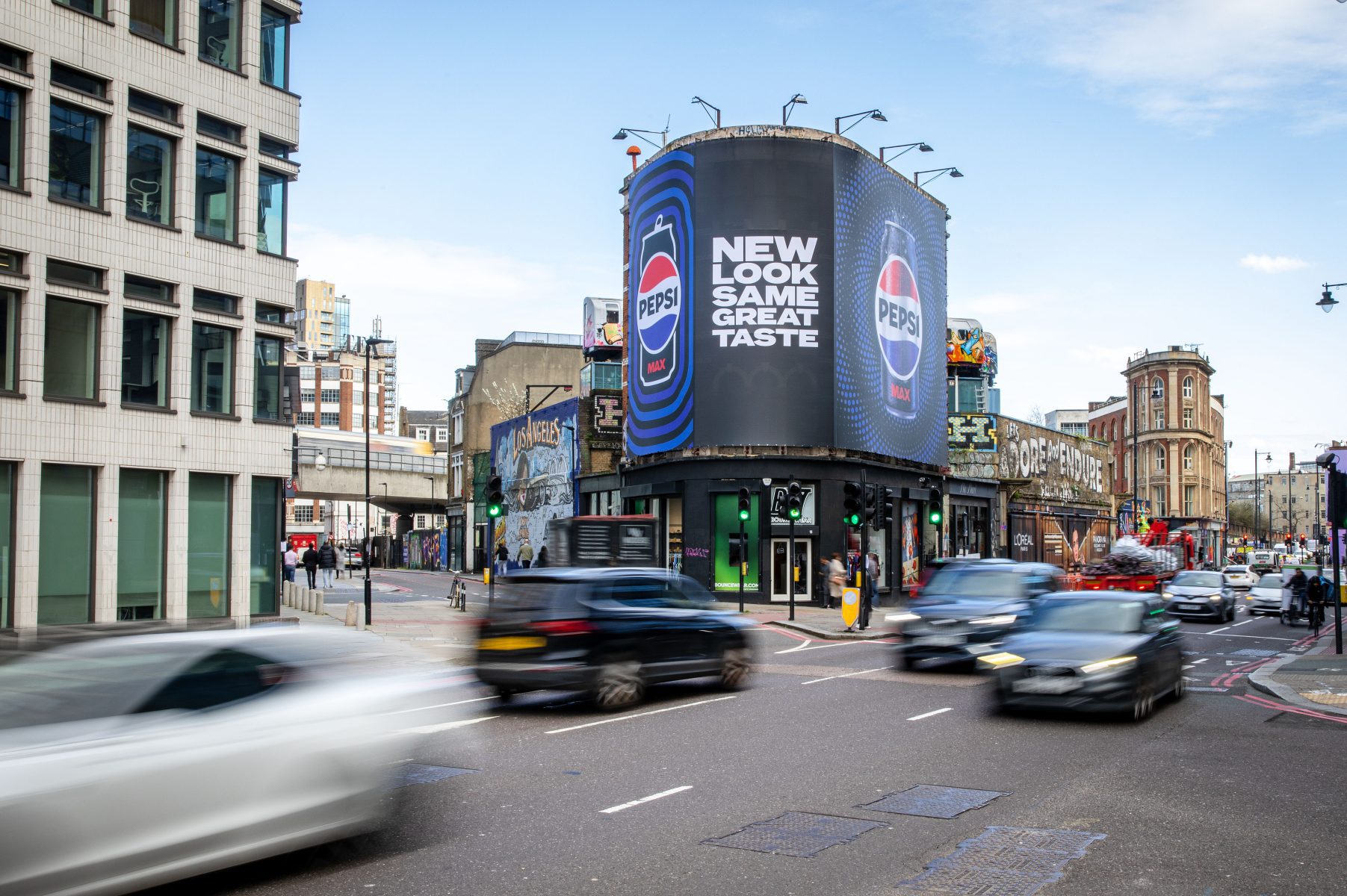
Kingsland Road – Campari
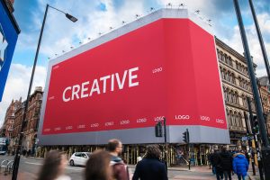
Manchester Piccadilly – Example
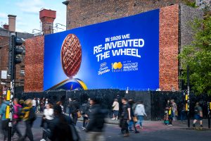
Manchester Central – McVities
Logo
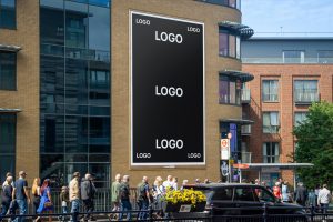
Optimising the logo size and placement by centering it in negative space or to the left or right of the talent. Logos work best when they are sized 30-40% of the width of the commercial space.
Logos will need to be adjusted to the shape of the site. The examples shown illustrate logo placements on a variety of our sites, including landscape, corner or curved sites.
Marylebone – Example
Twickenham Central – Sport Direct
Twickenham Central – Example
Creative Separation
Some of our sites are most effective when the creative space is divided into multiple panels . This ensures the message remains clear and impactful from every angle.
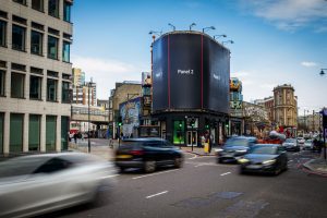
10 Great Eastern Street – Example
Brick Lane – New Balance
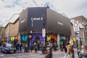
Brick Lane – Example